
Table of Contents
What is the best method for building an attractive and captivating photography website?
You will have to choose the best website creator and get inspired by the top websites for photographers.
Below we’ll show you examples of the 21 best photography websites; take at these portfolios to find new ideas to display your photographs.

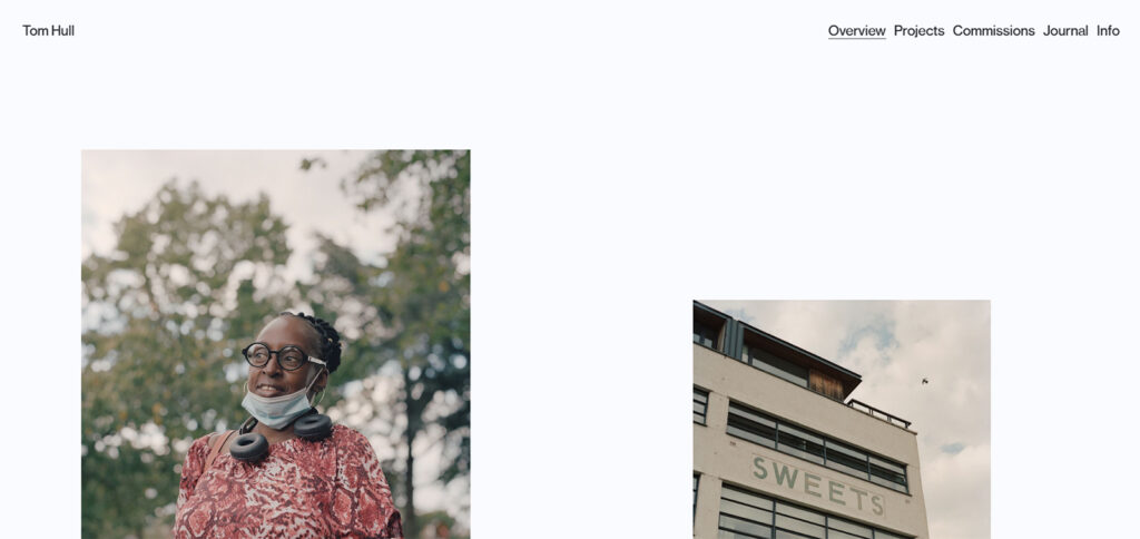
This is one of those examples of photography websites that look like an empty canvas. Tom Hull's portfolio creates the illusion of a blackboard or canvas with individual images placed periodically.
Since there is a lot of white space, each shot looks like a work of art framed by the area. This can convey an image of professionalism and modernity, generating a positive impression on website visitors.
Notes to take from this website:
Builder used: Custom

URL: https://www.ameliaallenphotography.com/
Amelia Allen is a London-based portrait photographer who publishes commercial and personal work. When visitors visit her website, they are immediately presented with a gallery of featured images, which makes an excellent first impression.
The gallery's side-scrolling feature enables you to view examples while keeping the navigation bar on the left side. This design style allows for better message presentation and avoids distractions.
Notes to take from this website:
Builder used: Format

URL: https://www.adambirdphotography.com/
This photographer focuses his work on fantasy pictures. Thwebsiteit has a minimalist design, avoiding unnecessary decorative elements. Instead, it emphasizes his photographs.
It also presents its projects in a grid structure, with simple navigation and a careful selection of images. Also, the menu is static and easy to use, allowing visitors to access their photos quickly.
Notes to take from this website:
Builder used: Format

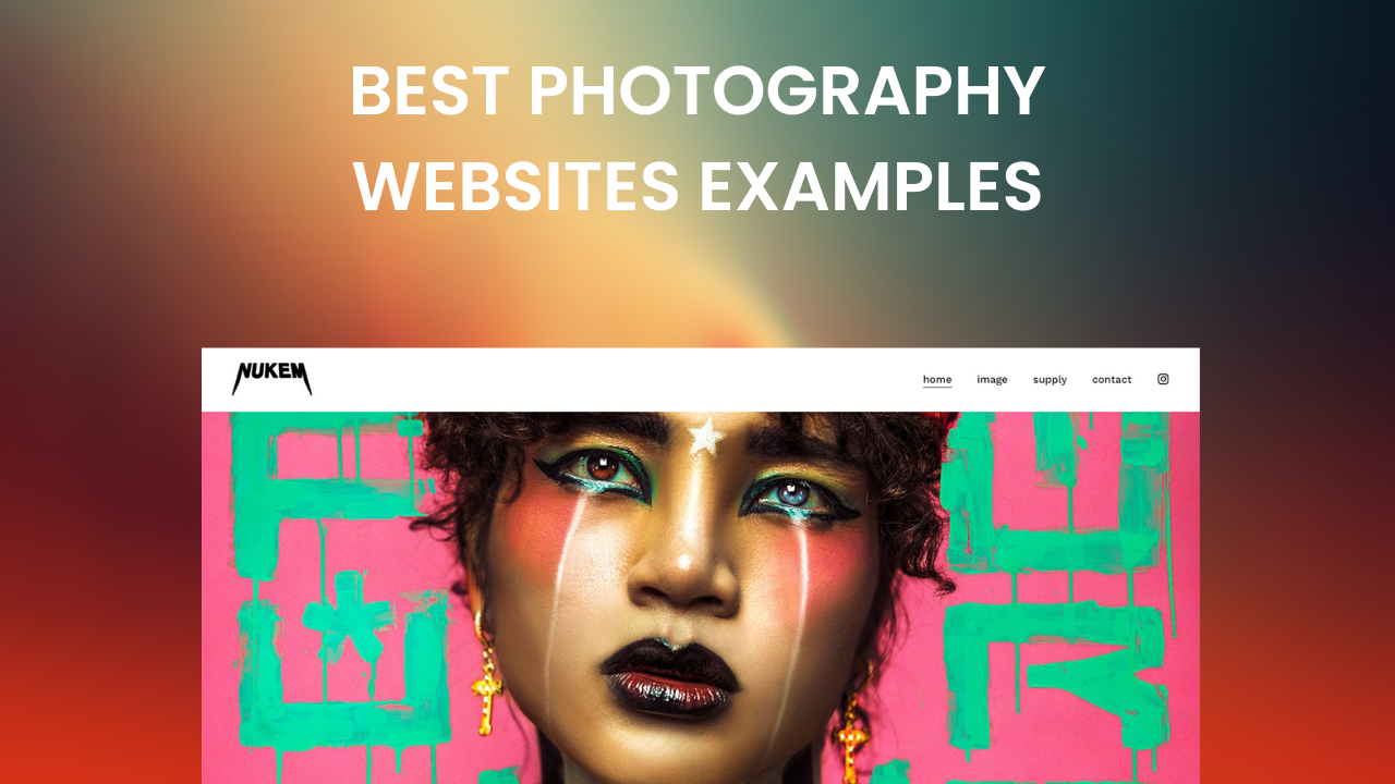
URL: https://www.harisnukem.com/
This photographer is famous for his high-quality photography, and his website is no exception. It features stunning images in a clean and organized layout, intuitive navigation, and the ability to browse different themes and galleries.
The website has a pop-up contact window where users provide their details and allows them to generate leads and build a contact list.
All these elements enable customers to feel comfortable and embellished by the photos.
Notes to take from this website:
Builder used: Squarespace

URL: https://www.pedrontheworld.com/
On his website, this photographer displays realistic, typical images that you see in everyday life. His site is modern and eye-catching, using sliding images that capture the user's attention.
Her menu consists of a few links to the categories of his work, and there is also a contact information section.
Additionally, the website uses neutral tones that match the style of his photographs generating visual pleasure throughout the site. These elements create a relaxing atmosphere and allow visitors to focus on the pictures.
Notes to take from this website:
Builder used: Squarespace

URL: https://www.sanzlena.com/
Based in Toronto, this fashion photographer follows what web designers tell you: keep it simple, even for a web portfolio. Sanz Lena's portfolio also has horizontal scrolling, which makes the overall user experience smooth.
Links to her social networks are also prominently placed at the top of the page. This is a clear example that if you want to guide visitors to other platforms, you should use the top header of your website.
By reducing the number of elements on the page, user interaction is simplified, resulting in a more fluid and enjoyable experience.
Notes to take from this website:
Builder used: Format

URL: https://www.arianajordan.com/
Ariana Jordan is a professional photographer from Kentucky. Her photography is based on telling stories of love with wedding and landscape photography.
The website has an attractive design, with a slider-based home page, which adds an interactive and vibrant element to the website.
The site also features a static menu, allowing visitors to quickly access the various sections without scrolling up to find the menu.
Additionally, a black background color is used, creating a sleek and professional appearance and enhancing the quality and artistic value of the photos presented.
Notes to take from this website:
Builder used: Squarespace

URL: https://cassandraladru.com/
Cassandra Ladru is a lifestyle and wedding photographer. Her style of photography is timeless, and she has worked for magazines such as Vogue and Harper's Bazaar.
Her website is journalistic, allowing visitors to see intimate moments in detail. The site also uses a drop-down menu for clean and orderly navigation.
The website has visual coherence by using the same color palette in all elements, such as backgrounds, texts, and buttons.
All these elements help create a visually harmonious and balanced appearance and attract visitors through the photographs' details.
Notes to take from this website:
Builder used: WordPress

URL: http://www.jasoncoxphoto.com/
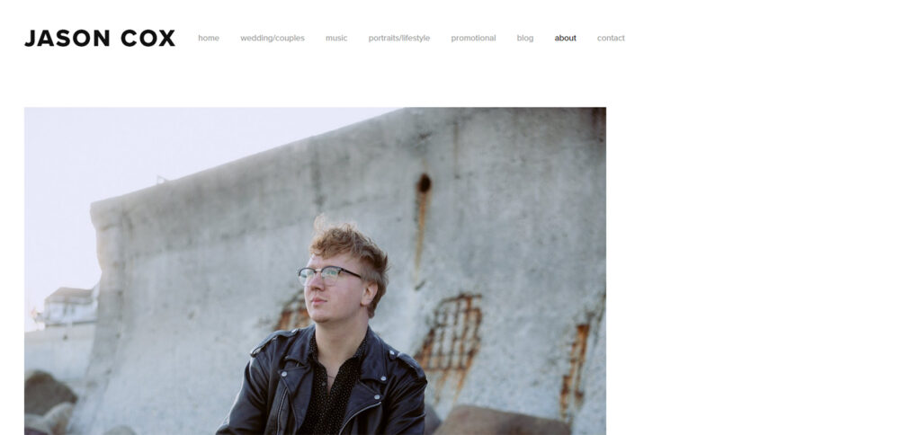
Jason Cox is a creative photographer from Boston. He has a photography website that showcases his diverse talent.
This website has a static menu that makes navigation visible and accessible at all times to clients.
The layout displays his photographs in a grid of photos, so visitors can quickly view and access multiple images simultaneously.
Contrasting colors are also used to highlight essential items and ensure good visibility.
These elements add identity to the brand and target audience for the photographic website.
Notes to take from this website:
Builder used: Squarespace

Julia and Gil are wedding photographers for couples who aim to capture the natural connection between couples.
Their minimalist website is based on a grid of photos in monochromatic colors, reducing visual distraction and providing a clean and sophisticated aesthetic.
On their blog, visitors can check out their work and read about the background of sure weddings they captured. Additionally, the site adapts to different devices and screen sizes.
These elements make the clients focus on their photographs and feel their meaning and beauty.
Notes to take from this website:
Builder used: WordPress

URL: https://www.dvilladsenphotography.com/
Diane Villadsen is a fashion and portrait photographer based in the United States. Her photography website is known for being simple but, at the same time, lively and colorful.
This site uses cinematic perspectives, imagery, and dreamy tones that hold the user's attention.
Also, its simplicity helps the photographs clearly and effectively convey the main message.
This website has a professional and attractive appearance that will attract the visitor's attention.
Notes to take from this website:
Builder used: Squarespace

URL: https://www.gracechuang.me/
The photographic work of Grace Chuang focuses on weddings, lifestyles, and adventures. The website is essential, using simple and legible typography.
The strategic use of white space is fundamental in the design of this website, as it allows the photographs to stand out, inviting visitors to stay longer and scroll further.
Menus and links are clear and logically organized so visitors can find the information effortlessly.
These features allow the photographs to be the main focus and stand out even more.
Notes to take from this website:
Builder used: Squarespace

URL: http://www.brandonkeith.photo/
Brandon Keith is a fashion and lifestyle photographer. He aims with his website to make it possible for people to enjoy his photos.
Its pictures scroll from left to right, allowing users to browse through the images as they would in a fashion magazine.
This effect can grab the user's attention and make the photos stand out more effectively.
Also, the website employs monochromatic colors reducing visual distraction and providing a subtle and sophisticated aesthetic.
Notes to take from this website:
Builder used: Squarespace

URL: https://www.jennamahr.com/
Jenna Mahr is a professional photographer who combines wedding and fashion photography. Her photography website matches her clear and minimalistic photography style.
The menu has hidden links to the images, making it easy to view her photos. And the use of a monochromatic color palette for the photographs.
There's nothing to distract users from the inspiring creativity of her work.
Notes to take from this website:
Builder used: Format

URL: https://www.jenniferperkins.co/
Jennifer Perkins is a commercial brand photographer. Her web design is kept simple and free of unnecessary elements.
Negative space is used strategically around the photographs to create a sense of calm. The site also focuses on pictures that are given prominence in the design.
Additionally, a minimalist and easy-to-use menu is used at the top of the page to allow visitors to access the gallery quickly.
Notes to take from this website:
Builder used: Squarespace

URL: https://liselottefleur.com/
Liselotte Fleur is a fashion photographer; she offers editorial and campaign photography creation for clients on her website. Her photography website is straightforward and elegant. The visitor can click on her projects and see the photos displayed in a creative arrangement.
Also, the images used on the site are of high quality. These are carefully chosen to complement the overall aesthetic, as they seek to convey professionalism and style through the images selected.
These features together create a sophisticated and attractive website for users.
Notes to take from this website:
Builder used: WordPress

URL: https://patkay.com/
Pat Kay is a freelance photographer based in Sydney, and her photographic work explores the contrast between nature and urbanscape.
Her photography website features a simple, white background that highlights her photographs of beautiful travel images.
The color palette used on the website is monochromatic, fitting the style and theme of the website. It allows users to concentrate all their attention on the Pictures.
All these elements give the website a balanced and clean appearance, improving readability.
Notes to take from this website:
Builder used: Custom

URL: https://www.thefaroes.co/
This website offers photographic services worldwide where anyone can join. The site has a static menu providing quick access to sections.
It also incorporates an Instagram feed, encouraging interaction and participation of visitors. Neutral colors are used to highlight essential elements.
Those elements enhance the user experience and highlight the photographic images featured on the website.
Notes to take from this website:
Builder used: Squarespace

Lauren Naylor is a photographer based in Los Angeles. Her photographs feature shades of moodiness and dreamy landscapes.
She displays her work through a creative grid, allowing users to easily browse the photos and click on those that catch their attention.
The site has contrasting analogous colors, providing visual harmony and softness. Such elements facilitate the presentation and navigation of visual content for users.
Notes to take from this website:
Builder used: Format

Tayler Smith is a professional photographer from New York. He shoots dog portraits, product photography, style life, and beauty.
His photographic website is colorful and fun. Two images fill the entire screen each time, showcasing their lively style.
This visual detail enriches the user's experience on the website by using contrasts to highlight important features and create a clear visual order.
Also, the website use links as a menu at the upper left, keeping the website clean.
Notes to take from this website:
Builder used: Squarespsace

Deanie Chen is a freelance photographer, and People Magazine, Spotify, and Billboard have published photos.
She has a section dedicated to her 35mm work on her photography website. She also shoots live music and portrait photography.
Her photographs are displayed in a simple but effective grid layout. And the choice of color palettes on the website design is clean and limited.
The simple design of his website facilitates navigation by presenting a clear structure and a well-defined visual hierarchy.
Notes to take from this website:
Builder used: WordPress
While deciding which are the best photography websites can be subjective and will depend on individual preferences, these examples stand out for their focus on photography, minimalist design, and user-friendly navigation and layout.
As many photographers say, creating a website requires different elements and continuous changes, but the only way to do a great job is to love what you do.