

Table of Contents
Google Sites is a great and simple way to create a website quickly and easily. Many users have been able to create visually appealing and functional websites.
Whether you're building a personal website or a business site, the examples found offer inspiration and valuable insights into effective design principles.
This article will explore some of the best Google Sites website designs and highlight what we can learn from them.
URL: https://www.filiprzepka.com/
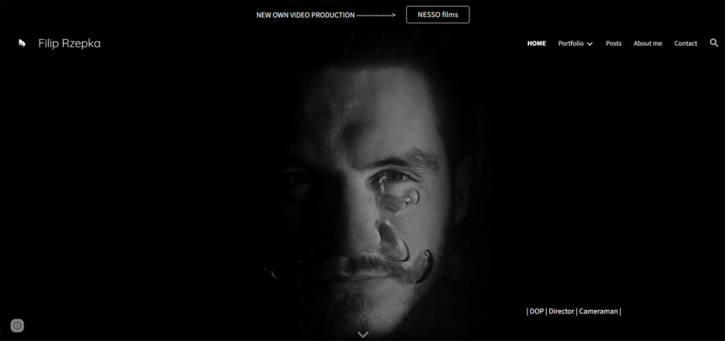
Filip Rzepka's website has an impressive design. The animated full-screen background, sticky top bar, and simple footer with social media icons caught our attention. This website serves as an excellent example of a videographer's portfolio website.
It effectively showcases the author's work on the homepage and on a dedicated page, while integrating their Instagram account and providing more information about the author and their services.
The contrasting color scheme draws focus to the author's work, and access to social media accounts and a contact page are available.
Notes to take from this website:
Builder used: Google Sites

Jae Hoon Choi's Google Sites portfolio website is a great example of minimalist design. The clean header and footer are well-separated from the base.
The site provides comprehensive information about the author, including his biography, research, and teaching background. Visitors can view and download his personal CV as well.
This website design can inspire anyone looking to develop a minimalist and informative portfolio website.
Notes to take from this website:
Builder used: Google Sites

Jivrus' Google Sites website showcases an impressive, scrollable layout with vibrant colors that immediately catch the user's attention. The home page is packed with valuable information on the business, products, and solutions offered.
The site also includes a separate section for testimonials and customer logos that enhance social proof.
Overall, the website's comprehensive design and layout make it a great example to learn from.
If you're looking for inspiration, take a look at Jivrus' website to discover innovative design ideas that you can incorporate into your Google Site.
Notes to take from this website:
Builder used: Google Sites
URL: https://www.avoxarchitects.co.za/
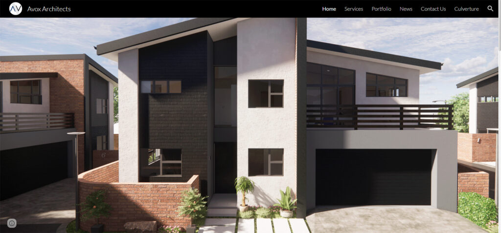
Avox Architects' website showcases their amazing architecture projects through crisp images on a full-screen slideshow with a parallax effect.
The homepage is clean and distraction-free, allowing visitors to enjoy each slide without any text or call-to-action buttons. The floating header keeps the navigation and search bar always available, making it easy for visitors to access the website's different pages.
Avox Architects' website is a great example of a good architecture website with a unique portfolio page and a clean, distraction-free homepage.
Notes to take from this website:
Builder used: Google Sites

Xu Chu's Group's website on Google Sites is an excellent example for students looking to create a research or academic defense website.
The homepage features a stunning image of rocks and bold titles that effectively convey the website's purpose.
The hero image also has a parallax effect, making the website more engaging. The transparent header solidifies and sticks to the top of the screen when you scroll down. Despite being short, the homepage is well-organized and functional, making it easy to navigate.
The website is a great source of inspiration for those looking to create their own website on Google Sites, especially those interested in incorporating the parallax effect.
Notes to take from this website:
Builder used: Google Sites

URL: https://www.e-gamingexperts.com/
The design of E-Gaming Experts' website is both simple and effective, with a clean and straightforward layout that enables users to locate the information they require quickly.
The homepage's floating navigation bar and banner, which contains a clear title and informative text, are particularly noteworthy, as they help to improve the site's overall user experience.
Lastly, including a clickable email in the footer section provides users with a convenient way to contact the company.
Notes to take from this website:
Builder used: Google Sites

URL: https://www.flippingretail.com/
Flipping Retail's website design is minimalist and effective. The homepage has a parallax hero area, a simple grid, and a floating header that acts as a navigator.
The website has only three primary pages, making it easy to navigate and focused on conversions. The segmented formatting of each page is clear and organized, providing visitors with easy access to specific areas of the site.
One can learn from this example the importance of simplicity, effective navigation, and focused content in web design. Additionally, using a quote or bold company message in the footer can add a personal touch to the site.
Notes to take from this website:
Builder used: Google Sites

URL: https://www.restonent.com/
The design of the Reston ENT website is modern and well-organized. The use of a clean and simple layout, with a consistent color scheme and font style, creates a professional and trustworthy image.
The website provides easy access to important information. Additionally, the use of high-quality images to the overall user experience.
Overall, the Reston ENT website design effectively communicates the practice's professionalism and dedication to quality patient care.
Notes to take from this website:
Builder used: Google Sites

Preesh.us is a good example of a minimalist and sleek website design that successfully uses the Google Sites platform to showcase its podcasts. With a rich assortment of popular podcasts, the site provides a playlist feature for users to access and listen to their favorite shows easily.
The home page sports a visually stunning full-screen image background with a parallax effect, and the floating header effortlessly guides visitors to explore more pages for additional information.
The website's use of contrasting colors not only makes it visually appealing but also helps to make it more dynamic.
Notes to take from this website:
Builder used: Google Sites

URL: https://www.petersfieldhigh.com/
Petersfield High School's Google Site uses vibrant colors and branding to capture the attention of visitors instantly. Along with embedded videos, the site features a flipbook for an engaging content experience.
This exemplifies how Google Sites can deliver multimedia content while maintaining loading speed.
The site's design showcases notable photos, call-to-actions, and an extensive header menu. Strategic use of branding and colors is crucial when creating a website to make it stand out.
Notes to take from this website:
Builder used: Google Sites
URL: https://www.moalboaladventures.com/
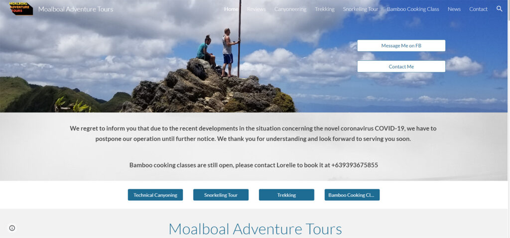
Moalboal Adventures provides personalized adventure activities in the southern region of Cebu, Philippines. The website is easy-to-navigate layout lets visitors quickly find and select their preferred tour option.
This showcases how Google Sites can create a user-friendly website with clear instructions, allowing for a seamless user experience.
The site features high-quality photos and videos that showcase the different adventure activities available, capturing the attention of visitors immediately.
Notes to take from this website:
Builder used: Google Sites

PVFT (Putnam Valley Federation of Teachers) is a Google Site used for professional purposes. The website's layout allows easy navigation, with sections like Officers, Calendar, Minutes, and
Benefits, making it simple to find the required information. Users can also filter their search for quick access.
Additionally, the website has a Donate section where visitors can make donations to support the Federation's members and activities.
Notes to take from this website:
Builder used: Google Sites
URL: https://www.huegelpto.com/
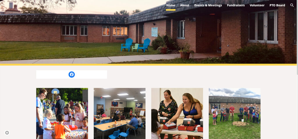
The Huegel Eagles PTO website boasts an attractive and user-friendly design. It features a clean layout that allows for easy navigation, as well as high-quality images that add visual interest and effectively communicate information.
Additionally, visitors can stay informed with the latest school news and upcoming PTO events thanks to the calendar and news sections.
The site also offers convenient ways to communicate with parents, including virtual and in-person meetings.
Notes to take from this website:
Builder used: Google Sites

URL: https://www.googledrawings.org/
The Google Drawings portfolio website is an excellent example of a visually stunning design. The full-screen responsive web layout and full-width image sections displaying artwork create an immersive experience for visitors.
The parallax effect on the hero image with text overlay provides quick artist information, while the sticky header includes menu links and social media icons.
This website showcases the importance of using a full-width and full-screen design to showcase your beautiful images.
Google Drawings demonstrates how to create a portfolio-like website, including resources and visual imagery that accompany the artist's process.
Notes to take from this website:
Builder used: Google Sites

URL: https://www.joshuapomeroy.com/
Joshua Pomeroy's Google Site demonstrates excellent web design for personal websites.
The portfolio homepage uses a full-width grid layout to showcase his skills and expertise.
Clean background with colorful graphics creates a visually stunning impact. In summary, Joshua Pomeroy's Google Site is a great example of how to design a personal website that lets the artist's work speak for itself.
Notes to take from this website:
Builder used: Google Sites
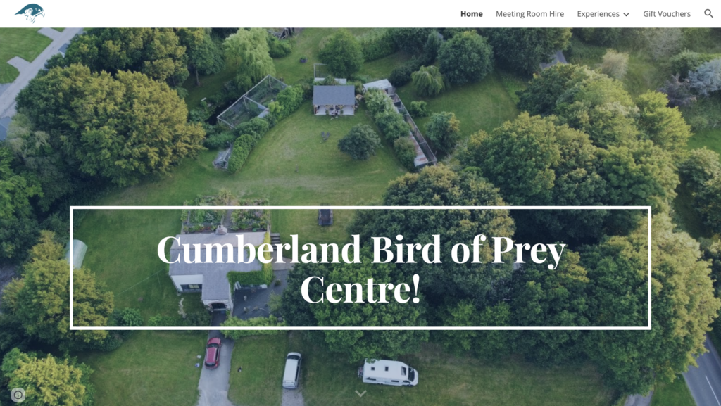
URL: https://www.birdofpreycentre.co.uk/
The design of Cumberland Bird of Prey Centre's Google Site is visually engaging and easy to navigate.
The homepage prominently features a stunning view of the venue, immediately attracting potential clients.
The site's use of internal links directs visitors to more detailed pages, and its live Facebook feed keeps them up-to-date with the latest news.
Overall, the site effectively showcases the unique services of the Cumberland Bird of Prey Centre while providing a seamless user experience for visitors.
Notes to take from this website:
Builder used: Google Sites
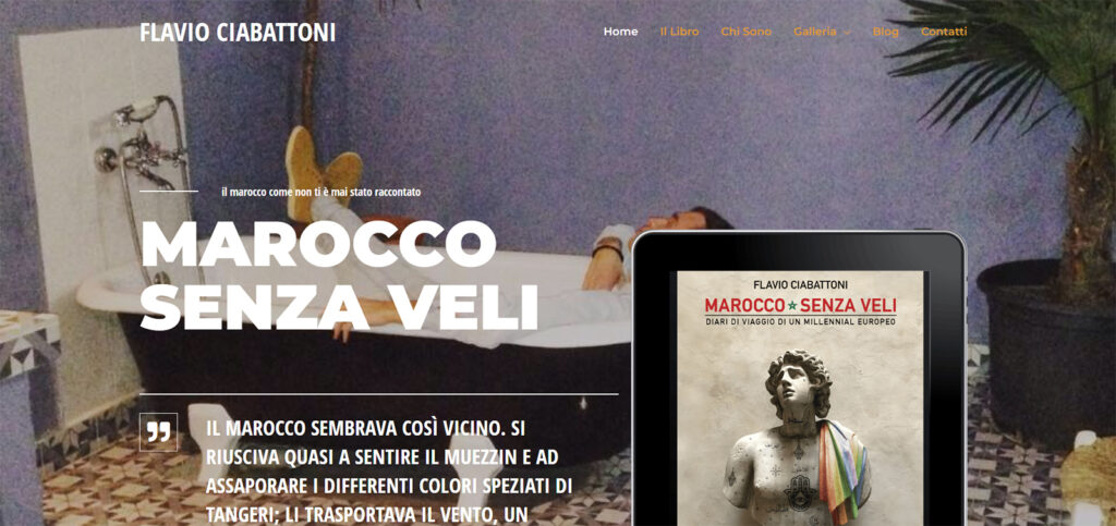
URL: https://flaviociabattoni.com/
Flavio Ciabattoni's website showcases effective use of Google Sites' design trends with a strong first impression through a background image and a transparent header.
The homepage features a scrollable photo gallery with parallax effects and a clear, actionable above-the-fold section with a CTA button.
The use of typography and imagery creates an interesting design, while a stylish dark theme ties everything together. The website successfully highlights Flavio's products, making good use of the homepage.
Overall, the website provides a pleasant browsing experience with unique and fitting design elements.
Notes to take from this website:
Builder used: Google Sites
The examples of Google Sites website designs discussed in this article demonstrate platform's versatility in creating visually appealing and functional websites.
From stunning visuals to the effective use of typography and navigation, these websites demonstrate the importance of user experience and effective design principles.
By taking notes from these examples and applying them to your own website, anyone can create a beautiful and functional website using Google Sites.